What's New?
In dashboards and custom reports, every widget's number stat shows a trend badge (▲/▼ with % change), and you can now control whether an increase or a decrease in that number should be colored positive (green) or negative (red).
Metrics where lower is better — like unsubscribe rate, bounce rate, churn, or cost per lead — can now show accurate trend colors instead of always assuming "higher is good."
This applies no matter which chart type you've picked for the widget — Number, Line, or Bar — since the trend badge appears consistently across all of them when "Comparison Date Range" is set.
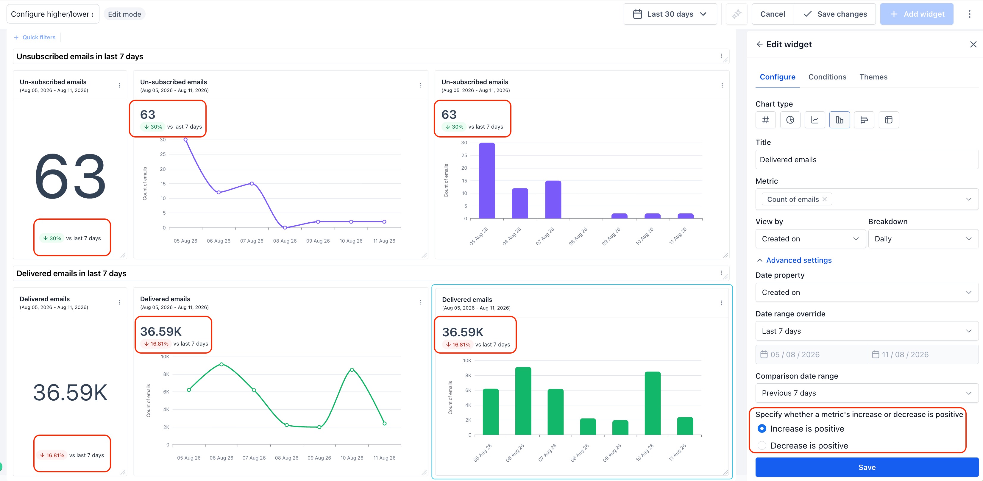
Metrics like unsubscribe or bounce rate no longer show a misleading green arrow when they go up. For example, a falling unsubscribe rate now shows green (good), while a falling delivered-email count still shows red (needs attention).
How It Works:
- Open the widget's Configure panel.
- Under Advanced settings, configure "Date range override" and "Comparison date range"
- Specify whether a metric's increase or decrease is positive. Choose Increase is positive (default) or Decrease is positive, based on how the metric should be read.
- Save changes — the trend badge color updates automatically, on every chart-type view of that widget.
Why It Matters:
- Accurate trend signals — Metrics like unsubscribe or bounce rate no longer show a misleading green arrow when they go up.
- Builds client trust — Accounts sharing dashboards with clients can trust that green always means "good," even for cost or churn metrics.
Notes:
- Existing widgets default to "Increase is positive" — no widget's color behavior changes unless you update it.
- Setting lives in the widget's Configure panel and applies regardless of the chart type selected for that widget.
Was this article helpful?
That’s Great!
Thank you for your feedback
Sorry! We couldn't be helpful
Thank you for your feedback
Feedback sent
We appreciate your effort and will try to fix the article